Overview
Five systems, zero shared truth
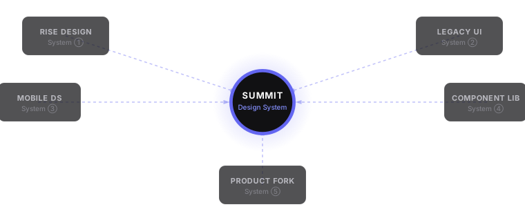
Constant Contact is consolidating five fragmented design systems into Summit — one Figma library, one Storybook, one token system that 20+ designers and 60+ engineers can both trust. The mandate is consolidation. The opportunity is bigger: to build the system in an AI-native way from the start, so Summit’s naming, structure, and documentation are as legible to an AI agent as to a new designer.
My role in Summit is component design lead — owning the specification, documentation, and cross-functional alignment for the components that every mobile web and native app surface builds on. The two major active workstreams are Sheet and bottom sheet standardization and List Control Building Blocks. This case study covers both, along with the architectural principles that shape how I approach every component in the system.
The Challenge
Five systems. Zero truth.
Before Summit, auditing the Constant Contact component landscape meant confronting a matrix of contradictions: the same component — a button, a form input, a data table — designed and implemented five different ways across five different teams. No shared tokens. No accessibility standards. No single answer to “what does a primary button look like?”
The audit was where I earned the right to make architectural decisions. It revealed not just inconsistency but the structural root cause: there was no agreed-upon information architecture for the system itself — no shared naming conventions, no component hierarchy, no documentation standard. Before we could build one unified system, we had to define what that system’s own structure should be.
| Component Area | Rise ① | Legacy UI ② | Mobile DS ③ | Comp. Lib ④ | Product Fork ⑤ |
|---|---|---|---|---|---|
| Buttons & CTAs | ⚠ Inconsistent | ⚠ Inconsistent | ✓ Aligned | ✕ Inaccessible | ⚠ Forked |
| Typography | ✓ Aligned | ✕ Inaccessible | ⚠ Inconsistent | ⚠ Inconsistent | ✕ Legacy |
| Form Inputs | ⚠ Inconsistent | ⚠ Inconsistent | — Missing | ✓ Aligned | ⚠ Forked |
| Data Visualization | — Missing | ✕ Inaccessible | — Missing | ⚠ Inconsistent | ✕ Color-only |
| Color Tokens | ⚠ Primitives only | ✕ Hardcoded | ✕ Hardcoded | ✕ Hardcoded | ✕ Hardcoded |
“The gap between design specification and production implementation wasn’t a process failure. It was a structural one. We didn’t need better handoff — we needed a system designers and engineers could both trust.”
Active Work
What I’m building in Summit
Summit is not a side project — it’s the system every team at Constant Contact ships against. My contribution is in the hardest part: the components that show up everywhere, on every surface, across mweb and mapp. Getting those right requires more than good design. It requires written decisions, interactive specifications, stakeholder alignment, and documentation that doesn’t become stale the sprint after it’s published.
The two workstreams below represent that work in practice.
Workstream 01 · Sheet & Bottom Sheet
One rule, one component, every contextual overlay in the product
Before this initiative, Summit had two separate component sets — Sheet and Bottom Sheet — with inconsistent usage guidance, conflicting anatomy, and no clear rule for when to reach for one versus the other. Different product teams had made different calls, and the result was a fragmented overlay experience across mweb and mapp.
I led the standardization effort: a unified Sheet organism covering both surfaces, a single set of usage rules, and the documentation and prototypes that give teams a clear answer at the point of design rather than in review.
The one rule
Brief task → sheet. Sustained workflow → full page. If the interaction requires sustained attention, complex navigation, or more than three steps of drill-down, it belongs on its own page — not in a sheet.
That single rule resolved the majority of ambiguous cases. The rest of the guidelines — anatomy, drill-down behavior, sizing, keyboard handling, dismissal, adaptive layout — build from it.
Key decisions documented
Prototypes as living specs
Written guidelines aren’t enough for complex interactive components. I built three interactive HTML prototypes that serve as executable references for engineering — not mockups, but functional demonstrations of the specified behavior:
Beyond the prototypes, I built a comprehensive guidelines document (Material 3–style, with sidebar navigation), a design review presentation deck for critique sessions, and a decision brief on drill-down step limits with industry comparisons. All artifacts are linked from the Summit documentation hub.
Workstream 02 · List Control Building Blocks
Two components, not one — and why the distinction matters
The second major workstream is Ninety’s — sorry, Constant Contact’s — list and row patterns. Before the audit, these were inconsistent across every surface: campaign lists, contact lists, settings rows, and navigation rows all made different structural decisions, with no shared anatomy or behavior model.
The audit surfaced a core architectural question that had never been explicitly answered: is a list row a single component, or is it two?
The core finding: Tile and List Item are two distinct, composable components. Tile is layout — it defines the three-zone structure (leading · content · trailing) and how those zones flex and truncate. List Item is behavior — it defines the interactive states (tap, hover, focus, selected, disabled). They compose together, but they’re not the same thing, and conflating them is what caused most of the inconsistency in production.
Audit findings
The audit findings were packaged into shareable visual guides (Tile vs. List Item, Three Interaction Models), an interactive prototype demonstrating the three-zone anatomy with live zone highlighting, a side-by-side campaign list comparison showing production vs. proposed Tile-based layout, and a generated PPTX stakeholder readout for the CPD-20568 epic review.
Phase 01 · Token Architecture
The most important decision in the project
I built Summit’s token system as the structural backbone — the layer that makes future rebranding, dark mode, and white-labeling possible without touching a single component. Two layers: primitives (raw values) and semantics (meaning).
A button doesn’t know it’s blue. It knows it uses color.action.primary. Change the primitive, and every surface updates. This distinction is the difference between a design system that stays current and one that needs a ground-up rebuild every two years.
The token architecture also creates a traceable pipeline: Figma variables → design tokens → Storybook-validated components. Changes flow in one direction. The semantic layer means a theme change or rebrand updates Figma and code simultaneously — not through a manual sync between two sources that are always slightly out of date with each other.
Phase 02 · Accessibility
Impossible to fail by accident
Accessibility at most companies is a checklist — something audited after components ship. At Summit, I made it a design constraint at the token layer. Color contrast was enforced structurally: using semantic tokens correctly made it impossible to ship a non-compliant combination. The question shifted from “does this pass?” to “how do we make it structurally impossible to fail?”
This matters even more in an AI-assisted workflow. If an AI agent is generating UI from Summit components, accessibility should be guaranteed by the system itself — not dependent on the agent making the right color choice.
Three buttons. Three visual languages. Zero shared tokens.
color.action.primary
Semantic ✓
One standard. Structurally impossible to fail.
Phase 03 · Data Visualization
Color-only charts fail 8% of users by design
Constant Contact’s reporting surfaces are data-dense: open rates, click rates, subscriber trends, benchmark comparisons. Before Summit, every team built its own charts. Color-only differentiation was endemic — fine for most users, invisible to roughly 1-in-12.
I built a data viz framework that addressed color-only differentiation structurally. Categorical palettes were designed with non-color encoding as a requirement, not an afterthought: line style and marker shape carry information independently of hue. The result is charts that pass WCAG without visual compromise.
Phase 04 · AI-Native Architecture
Built to be legible to agents, not just designers
As AI-assisted design and development workflows have become real at Constant Contact, a design system faces a new kind of consumer: AI agents that need to understand, select, and apply the right primitives without a human making every micro-decision. Summit was built with this in mind from the start.
The insight I kept returning to: naming is documentation. A token named color.action.primary tells an agent what the token is for. A component named InsightCard.dismissible carries its own usage context. The information architecture of the system itself — how things are named, organized, and described — determines whether an AI agent asked to “build the campaign results screen” reaches for the right primitives or invents new ones.
color.feedback.warning instead of color.yellow. Appearance changes. Intent doesn’t.The test I apply: if a designer prompts an AI agent to build a screen using Summit, does the agent reach for InsightCard or does it reinvent it? If the system’s naming and documentation are good enough, the agent gets it right without a human correcting it afterward. That’s the bar Summit is designed to meet.
Phase 05 · Governance
Low governance tax. High adoption.
A common failure mode: ship a beautiful system, publish it to Figma, and watch it fragment over the next eighteen months because the contribution process is too heavy and the workaround is easier. Summit’s governance model was designed around a core belief: if contributing to the system costs more than forking, people will fork.
That meant designing the process for real teams under real deadline pressure — not the idealized workflow those teams wish they had. Any designer, engineer, or PM can propose a new pattern. The intake process is lightweight: a brief that captures the problem statement, what alternatives were considered, and the intended adoption scope. No proposal committee. No lengthy review cycle.
Any designer, engineer, or PM can propose. A structured intake brief captures the problem, alternatives considered, and adoption scope — lightweight enough to complete in under an hour.
Every change ships with release notes and a deprecation window. Nothing is removed without a migration path. Teams don’t fear updates because they’re never surprised by them.
The system has to be easier to use than whatever workaround a team would reach for. Every point of friction in the contribution or adoption process is a risk that someone forks instead.
Summit v1 was a foundation, not a finalization. The token architecture supports rebrands, new platforms, and new AI interaction patterns without a ground-up rebuild.
Impact
What changes when the foundation is right
The impact of Summit isn’t visible in any single shipped screen. It’s visible in what stopped happening: the design review arguments over button styles, the accessibility tickets filed in production, the sprint delays from ambiguous specs, the onboarding friction of learning five systems before you could contribute to one.
And it’s visible in what’s now possible: AI-assisted design and development workflows that reach for Summit primitives and produce something shippable — not something that has to be rebuilt because it diverged from the system.
Reflection
What I’d carry forward
The audit is where you earn the right to make architectural decisions. The organizations most eager to skip it are the ones who most need it — because the politics of “we don’t have time” are exactly what created five systems in the first place. The audit also surfaces the highest-leverage consolidation opportunities, so you can sequence the work to build credibility through early visible impact rather than disappearing into a 12-month foundation project.
The information architecture of the system itself — naming conventions, component hierarchy, documentation structure — is not a style preference. It determines whether the system is navigable by new designers, by AI agents, by engineers who weren’t in the room when it was built. Get the IA wrong and adoption becomes a training problem instead of a system quality problem.
The semantic layer isn’t a theming convenience — it’s a decision about whether your system can support the business in ten years. That conversation belongs in design leadership, not a Figma file. Getting exec buy-in on the token architecture was as important as building it.
Design the process for the actual behavior of real people under real constraints. If contributing to the system is heavier than copying a component and moving on, people will copy and move on. The governance model that survives is the one that’s easier to use than the workaround — and that has a defined lifecycle for every component, not just the ones that caused a problem.
When we built Summit, the next consumer of the system was an AI agent. Naming, documentation structure, and component APIs that are unambiguous for a human are doubly important for an agent that can’t ask a clarifying question. The systems that will hold up over the next decade are the ones designed with that consumer in mind from the start.